Beta distribution是最常用的一個分配
我們看到的一般是
General beta (α,β,min, max)
前面兩個是shape parameters 後面兩個是 range parameters
其他相關的可以參考wiki連結
http://en.wikipedia.org/wiki/Beta_distribution
2010年2月19日 星期五


[轉錄] Histogram 製作方法
實用參考連結。
Creating a Histogram in Excel
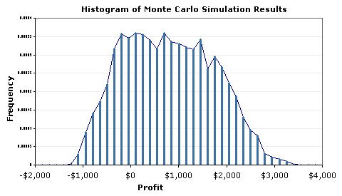
Sales Forecast Example - Part IIIIn Part II of this Monte Carlo Simulation example, we completed the actual simulation. (If you haven't already, Download the example spreadsheet). We ended up with a column of 5000 possible values (observations) for our single response variable, profit. The last step is to analyze the results. We will start off by creating a histogram in Excel, a graphical method for visualizing the results.
We can glean a lot of information from this histogram:
- It looks like profit will be positive, most of the time.
- The uncertainty is quite large, varying between -1000 to 3400.
- The distribution does not look like a perfect Normal distribution.
- There doesn't appear to be outliers, truncation, multiple modes, etc.
The histogram tells a good story, but in many cases, we want to estimate the probability of being below or above some value, or between a set of specification limits.
Creating a Histogram in Excel
Method 1: Using the Histogram Tool in the Analysis Tool-Pak.
This is probably the easiest method, but you have to re-run the tool each to you do a new simulation. AND, you still need to create an array of bins (which will be discussed below).
Method 2: Using the FREQUENCY function in Excel.
This is the method used in the spreadsheet for the sales forecast example. One of the reasons I like this method is that you can make the histogram dynamic, meaning that every time you re-run the MC simulation, the chart will automatically update. This is how you do it:
Step 1: Create an array of binsThe figure below shows how to easily create a dynamic array of bins. This is a basic technique for creating an array of N evenly spaced numbers.
To create the dynamic array, enter the following formulas:
B6 = $B$2
B7 = B6+($B$3-$B$2)/5
Then, copy cell B7 down to B11
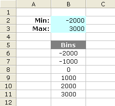
Figure 2: A dynamic array of 5 bins.
After you create the array of bins, you can go ahead and use the Histogram tool, or you can proceed with the next step.
Step 2: Use Excel's FREQUENCY formula
The next figure is a screen shot from the example Monte Carlo simulation. I'm not going to explain the FREQUENCY function in detail since you can look it up in the Excel's help file. But, one thing to remember is that it is an array function, and after you enter the formula, you will need to press Ctrl+Shift+Enter. Note that the simulation results (Profit) are in column G and there are 5000 data points ( Points: J5=COUNT(G:G) ).
The Formula for the Count column:
FREQUENCY(data_array,bins_array)
a) Select cells J8:J48
b) Enter the array formula: {=FREQUENCY(G:G,I8:I48)}
c) Press Ctrl+Shift+Enter
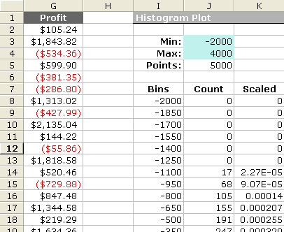
Figure 3: Layout in Excel for Creating a Dynamic Scaled Histogram.
Creating a Scaled Histogram
If you want to compare your histogram with a probability distribution, you will need to scale the histogram so that the area under the curve is equal to 1 (one of the properties of probability distributions). Histograms normally include the count of the data points that fall into each bin on the y-axis, but after scaling, the y-axis will be the frequency (a not-so-easy-to-interpret number that in all practicality you can just not worry about). The frequency doesn't represent probability!
To scale the histogram, use the following method:
Scaled = (Count/Points) / (BinSize)
a) K8 = (J8/$J$5)/($I$9-$I$8)
b) Copy cell K8 down to K48
c) Press F9 to force a recalculation (may take a while)
Step 3: Create the Histogram Chart
Bar Chart, Line Chart, or Area Chart:
To create the histogram, just create a bar chart using the Bins column for the Labels and the Count or Scaled column as the Values. Tip: To reduce the spacing between the bars, right-click on the bars and select "Format Data Series...". Then go to the Options tab and reduce the Gap. Figure 1 above was created this way.
A More Flexible Histogram Chart
One of the problems with using bar charts and area charts is that the numbers on the x-axis is actually just labels. This can make it very difficult to overlay data that uses a different number of points or to show the proper scale when bins are not all the same size. However, you CAN use a scatter plot to create a histogram. After creating a line using the Bins column for the X Values and Count or Scaled column for the Y Values, add Y Error Bars to the line that extend down to the x-axis (by setting the Percentage to 100%). You can right-click on these error bars to change the line widths, color, etc.
2010年2月13日 星期六
Authorization Only Transaction
Authorization Only (Auth Only) is a special type of sale transaction. It authorizes an amount on a customers card but the item does not settle until a later time, sometime several days or weeks.
授權交易是一種特別的交易,他授權店家在一段時間內保留一筆金額在信用卡內,等到通常幾天或幾個星期後才真正的扣款或取消。
The purpose of an authorization only transaction is to reserve an amount against a card holder's available credit limit for a certain period of time.
此交易的目的是為了在消費者信用額度內保留一定的金額,已確保未來能夠支付此消費。
For example, a merchant may perform an authorize only transaction if an item ordered is out of stock. Then when the item is in stock, the merchant will then settle the transaction, essentially charge the card at that time.
例如,如果一個東西缺貨中,店家可以先產生一筆授權交易,等到貨物到了以後再扣款。
Another reason a merchant may do an authorization only transaction is when the exact amount to be charged to a card is not know. This is often used in the hotel industry. When a patron checks in to a hotel, their card is authorized for an amount greater than the length of their stay. However, the transaction is not settled until check out, where the hotel may include any incidentals you may want to charge to your room. At checkout the hotel enters the actual final amount and then settles the transaction and the card is charged.
另一個情況是,當你購買東西的時候還不知道應該花費多少時,店家會先保留一部份較高的金額在你信用卡中,等到你真正消費後才扣款。例如當你進入旅館時,在check in櫃臺,他會先扣一筆高於你應該要付的錢,這部份包含了一些你可能產生的消費額度,等到真正要離開時,如果沒有那一筆消費他就會退錢給你。
One caveat is that if an authorization only transaction is not settled within 24 hours, then the transaction can downgrade to a different rate category and the merchant may be surcharged a small fee. However, the benefits of using an authorization only transaction by a merchant usually outweigh any additional costs involved, since by doing the authorization the merchant is still guaranteed payment.
要注意的是:如果授權消費沒有在24小時內結算,該交易可能會要多產生一筆手續費。但是就算有手續費,他的好處就是能夠確保消費者有能力支付此項目,所以還是很常在生活上看到。
授權交易是一種特別的交易,他授權店家在一段時間內保留一筆金額在信用卡內,等到通常幾天或幾個星期後才真正的扣款或取消。
The purpose of an authorization only transaction is to reserve an amount against a card holder's available credit limit for a certain period of time.
此交易的目的是為了在消費者信用額度內保留一定的金額,已確保未來能夠支付此消費。
For example, a merchant may perform an authorize only transaction if an item ordered is out of stock. Then when the item is in stock, the merchant will then settle the transaction, essentially charge the card at that time.
例如,如果一個東西缺貨中,店家可以先產生一筆授權交易,等到貨物到了以後再扣款。
Another reason a merchant may do an authorization only transaction is when the exact amount to be charged to a card is not know. This is often used in the hotel industry. When a patron checks in to a hotel, their card is authorized for an amount greater than the length of their stay. However, the transaction is not settled until check out, where the hotel may include any incidentals you may want to charge to your room. At checkout the hotel enters the actual final amount and then settles the transaction and the card is charged.
另一個情況是,當你購買東西的時候還不知道應該花費多少時,店家會先保留一部份較高的金額在你信用卡中,等到你真正消費後才扣款。例如當你進入旅館時,在check in櫃臺,他會先扣一筆高於你應該要付的錢,這部份包含了一些你可能產生的消費額度,等到真正要離開時,如果沒有那一筆消費他就會退錢給你。
One caveat is that if an authorization only transaction is not settled within 24 hours, then the transaction can downgrade to a different rate category and the merchant may be surcharged a small fee. However, the benefits of using an authorization only transaction by a merchant usually outweigh any additional costs involved, since by doing the authorization the merchant is still guaranteed payment.
要注意的是:如果授權消費沒有在24小時內結算,該交易可能會要多產生一筆手續費。但是就算有手續費,他的好處就是能夠確保消費者有能力支付此項目,所以還是很常在生活上看到。
[心情] 說一下這邊的學習
最近跟朋友討論
為什麼老師都教基本的定義
就要大家去做更進階的問題
這在台灣一定會造成反應
但是在這邊卻好像是理所當然的
雖然有老師會被反應教的沒有組織
但是很多課程都幾乎沒有特定的課本
上課就是一堆課本的綜合
特別辛苦
討論後才發現
這可能也需要配套的選擇學生吧
因為這邊的學生都能夠自己從課本上學
所以老師的目的是把大家的眼界提升到最新的研究上面
基礎的部分只教定義
然後題目出得很困難
讓學生知道自己的不足後
就會把那一塊補起來了
老師都會把重心放在最新的研究
或是把大家提升到問題的更核心的部分
總覺得這樣老師真的很有風險
因為學生很有可能就會說老師教的不好
但是老實說
這邊的教育真的比台灣紮實很多
基本上修三門四門課已經是極限了
上課教了基本的東西後
作業可以要你寫程式來模擬
可以要你做更進一步的證明
可以給open ended question讓你自己去發覺問題
自己去提出質疑並且嘗試解答
這樣的能力對於教育本質來說更符合常規
卻是台灣教育所忽視的
stop asking problem before you thought it through~
為什麼老師都教基本的定義
就要大家去做更進階的問題
這在台灣一定會造成反應
但是在這邊卻好像是理所當然的
雖然有老師會被反應教的沒有組織
但是很多課程都幾乎沒有特定的課本
上課就是一堆課本的綜合
特別辛苦
討論後才發現
這可能也需要配套的選擇學生吧
因為這邊的學生都能夠自己從課本上學
所以老師的目的是把大家的眼界提升到最新的研究上面
基礎的部分只教定義
然後題目出得很困難
讓學生知道自己的不足後
就會把那一塊補起來了
老師都會把重心放在最新的研究
或是把大家提升到問題的更核心的部分
總覺得這樣老師真的很有風險
因為學生很有可能就會說老師教的不好
但是老實說
這邊的教育真的比台灣紮實很多
基本上修三門四門課已經是極限了
上課教了基本的東西後
作業可以要你寫程式來模擬
可以要你做更進一步的證明
可以給open ended question讓你自己去發覺問題
自己去提出質疑並且嘗試解答
這樣的能力對於教育本質來說更符合常規
卻是台灣教育所忽視的
stop asking problem before you thought it through~
2010年1月20日 星期三
[心情] 緊張的一個學期
這幾天一直在想修課還有時間的問題
可是排了進度才發現根本時間不夠用
這學期期末就要考資格考
雖然科目上學期有學過
但是考的問題都是比上課教還要困難的問題
還要練習講述清楚解題思路還有方式
要練習的東西真多
要好好抓時間這學期
這幾天自從回來後一直有時差
現在調整到晚上九點左右睡然後五六點起床
希望能夠保持下去這樣的生活
畢竟頭腦清楚的一天是很不錯的
再來就是交通還有零碎時間怎樣掌握了
既然放棄了錢的機會
就要好好地準備考過這個考試~~
加油~~
可是排了進度才發現根本時間不夠用
這學期期末就要考資格考
雖然科目上學期有學過
但是考的問題都是比上課教還要困難的問題
還要練習講述清楚解題思路還有方式
要練習的東西真多
要好好抓時間這學期
這幾天自從回來後一直有時差
現在調整到晚上九點左右睡然後五六點起床
希望能夠保持下去這樣的生活
畢竟頭腦清楚的一天是很不錯的
再來就是交通還有零碎時間怎樣掌握了
既然放棄了錢的機會
就要好好地準備考過這個考試~~
加油~~
2009年12月23日 星期三
[心情] 掌握
一個學期轉眼就過去了
老實說...對於自己的表現並不是很滿意
雖然知道這些東西有一段時間沒有接觸了
不過也應該要掌握更好一點才是
仔細想想
這一個學期整個就是覺得時間不夠用
每天好像都在趕著做事情一樣
可能自己效率應該要加強
或是有時候需要靜下心來吧
伙伴比較少也是一個原因
畢竟在OSU時比較常會跟大家一起討論問題
但是在這邊因為課表的關係
常常大家都很忙碌
所以就各自趕自己的問題
趁現在break的時候要好好思考一下
自己的步調應該怎樣
還有讓自己身體狀況能後回到之錢的情況
常常在思考著
為什麼自己總是會因為心情緊張而失常
不過思考到最後只能回答『應該要練習到失常也很好的情況吧』
就像灌籃高手裡面說的『不要認為站在美國這片籃球王國發源地,光是呼吸就可以跳得比人家高』
我想『不要認為能待在好學校,自己能力就忽然比人家好』
自己要再努力一點,找到自己的步調
好好的走下去
老實說...對於自己的表現並不是很滿意
雖然知道這些東西有一段時間沒有接觸了
不過也應該要掌握更好一點才是
仔細想想
這一個學期整個就是覺得時間不夠用
每天好像都在趕著做事情一樣
可能自己效率應該要加強
或是有時候需要靜下心來吧
伙伴比較少也是一個原因
畢竟在OSU時比較常會跟大家一起討論問題
但是在這邊因為課表的關係
常常大家都很忙碌
所以就各自趕自己的問題
趁現在break的時候要好好思考一下
自己的步調應該怎樣
還有讓自己身體狀況能後回到之錢的情況
常常在思考著
為什麼自己總是會因為心情緊張而失常
不過思考到最後只能回答『應該要練習到失常也很好的情況吧』
就像灌籃高手裡面說的『不要認為站在美國這片籃球王國發源地,光是呼吸就可以跳得比人家高』
我想『不要認為能待在好學校,自己能力就忽然比人家好』
自己要再努力一點,找到自己的步調
好好的走下去

訂閱:
文章 (Atom)